Exploring Styling with Chakra UI
Chakra UI is a React component-based library that provides a set of accessible, reusable, and customizable components for building user interfaces. It was developed by Segun Adebayo. Chakra UI leverages Styled System to handle styling with Emotion serving as its default styling library. This ensures a consistent and utility-first styling approach for components. Utility-first styling is an approach in which styles are written directly within the component markup using utility classes or props, rather than defining styles in external stylesheets.
By the end of this article you're going to learn about what Chakra UI has to offer, why you should incorporate it into your project, and how to get started with it.
Now, let's explore the features that Chakra UI offers:
Compatible with React Frameworks
ChakraUI is framework-agnostic, which means that it does not work with a specific react framework but instead can work with any react-based project and is compatible with react frameworks such as NextJS, Vite, Gatsby, Remix, Redwood, Blitz, and Meteor.
Here's a simple example of using Chakra UI with Vite: Install Chakra UI with yarn (you could also install with npm, pnpm and bun).
yarn add @chakra-ui/react @emotion/react @emotion/styled framer-motion
Import ChakraProvider from @chakra-ui/react and wrap the root of your application with ChakraProvider.
// main.ts
import { ChakraProvider } from '@chakra-ui/react'

const rootElement = document.getElementById('root')
ReactDOM.createRoot(rootElement).render(
  <React.StrictMode>
    <ChakraProvider>
      <App />
    </ChakraProvider>
  </React.StrictMode>
)
Chakra UI Utilizes CSS-in-JS
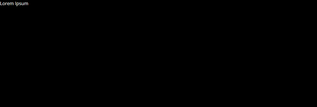
This means that styles are directly written within JavaScript or TypeScript code rather than in separate external CSS files. This approach has a lot of advantages such as simplified styling, avoidance of style clashes and naming conflicts, and it is easier to manage and maintain. With CSS-in-JS, unique CSS is automatically generated, thereby saving the time that would have been spent coming up with unique class names across the entire application. It also makes use of style props to style a component by simply passing shorthand props to it thereby saving time. Here's a simple example of the Chakra UI CSS-in-JS approach:
// Box by default renders a 'div' element
import { Box } from "@chakra-ui/react"

// Without style props
<Box backgroundColor={"#5db1c0"} height={"400px"}>Lorem Ipsum</Box>

// Using style props
<Box bg={"#5db1c0"} h={"400px"}>Lorem Ipsum</Box>
Whether you opt for CSS class names or style props, both accomplish the same in Chakra UI. Here's a rendered image of the above code

Responsive Design
Chakra UI, with the help of Styled System, provides responsive design utilities, which allow you to pass media queries as object and array values instead of manually adding @media queries. It uses the @media(min-width) media query to provide mobile-first responsive styles.
Below is the default set of breakpoints for Chakra UI, which you can customize according to your preferences.
// Default breakpoints
const breakpoints = {
  base: "0em", // 0px
  sm: "30em", // ~480px
  md: "48em", // ~768px
  lg: "62em", // ~992px
  xl: "80em", // ~1280px
  "2xl": "96em", // ~1536px
};
Here is an example of responsive styling in Chakra UI:
// Import the Image tag
import { Image } from "@chakra-ui/react";

// Passing media queries as object values
<Image src= {"/image"} w={{ base: "30px", md: "60px", lg: "80px" }}/>

// Passing media queries as array values
<Image src={"/image"} w={[30, 60, 80]}/>

// The above code generates this CSS
Image {
 width: 30px;
}
@media screen and (min-width: 30em) {
 Image {
    width: 60px;
  }
}
@media screen and (min-width: 48em) {
  Image {
    width: 80px;
  }
}
Prebuilt Components
Chakra UI comes with a variety of customizable pre-built components which enables you to, in the words of the Chakra UI documentation,
“spend less time writing UI code and more time building a great experience for your customers.”
It provides a wide range of ready-to-use components, including buttons, forms, modals, tooltips, and more. In this example, the Tooltip component is a prebuilt component provided by Chakra UI.
import { Tooltip } from '@chakra-ui/react'

const MyTooltip = () => (
<Tooltip label="Lorem Ipsum" aria-label='Lorem Ipsum'>
 I am a tooltip
</Tooltip>
)
Reusable Components and Universal Theme for Applications
Chakra UI provides a theming system that allows you to define and create custom theme objects with style properties such as colors, typography, sizes, breakpoints, etc. This theming system helps in creating reusable components that promote consistency and prevent repetition in code. It also helps to define a unified design language for the entire application. Chakra UI comes with a default theme but you can also customize it to suit your design requirements. This is an example that provides a customized color theme for the application:
//theme.js

// Import extendTheme
import { extendTheme } from "@chakra-ui/react"

// Call extendTheme and pass your custom values
export const theme = extendTheme({
  colors: {
    primary: '#fff',
    secondary: '#000',
  },
})

/*
Import ChakraProvider,
Import the theme from your file,
Pass the theme into ChakraProvider as a prop in your App component
*/
import { ChakraProvider } from '@chakra-ui/react';
import {theme} from './theme'

const App = () => {
  return (
    <ChakraProvider theme={theme}>
      <App />
    </ChakraProvider>
  );
};

//Usage
const DemoTheme = () => {
  return (
      <Box bg="secondary" color={"primary"} h={"400px"}>
      Lorem Ipsum
      </Box>
    )
}
The above code snippet returns this:
You can also create reusable components
import { defineStyleConfig } from '@chakra-ui/react'
const Button = defineStyleConfig({
  baseStyle: {
// The styles all your buttons have in common
    color: '#fff',
    backgroundColor: '#000'
    }
})

//Update the theme
import { extendTheme } from '@chakra-ui/react'
const theme = extendTheme({
  components: {
    Button,
  },
})

//Usage
const DemoButton= () => {
// You can restyle the component
  return <Button color="red">Lorem Ipsum</Button>
}
Custom Hooks
Chakra UI provides a collection of utility functions and hooks to address common scenarios in React applications. You can then tailor and customize these hooks to meet their specifications. An example is the useMediaQuery, which is used to indicate whether a query matches a specific breakpoint.
import { useMediaQuery } from '@chakra-ui/react'

const Example = () => {
  const [isLessThan768] = useMediaQuery('(max-width: 768px)')
// Usage
  return (
    <Box bg={isLessThan768 ? 'red' : 'black'}>
      Lorem Ipsum
    </Box>
  )
}
Color Mode
Chakra UI handles toggling between different color modes in an application. To achieve this you need to wrap your application with the ColorModeScript component:
import { ColorModeScript } from "@chakra-ui/react"
// Import extendTheme function
import { extendTheme, type ThemeConfig } from '@chakra-ui/react'

// Add your color mode config
const config: ThemeConfig = {
  initialColorMode: 'dark',
  useSystemColorMode: true,
}

// Extend the theme
const theme = extendTheme({ config })
export default theme

// Add it to the root file
 <React.StrictMode>
     <ColorModeScript initialColorMode={theme.config.initialColorMode} />
         <App/>
  </React.StrictMode>
Then use either the useColorMode hook or the useColorModeValue hook
// useColorMode hook
import { useColorMode } from '@chakra-ui/react'
// Usage
const { colorMode } = useColorMode()
  <Box bg={colorMode === 'light' ? '#fff' : '#000'}>
     Lorem Ipsum
  </Box>

// useColorModeValue hook
import { useColorModeValue } from '@chakra-ui/react'
// Usage
 <Box  bg={useColorModeValue('#fff', '#000')}>
// useColorModeValue(lightModeValue, darkModeValue)
     Lorem Ipsum
  </Box>
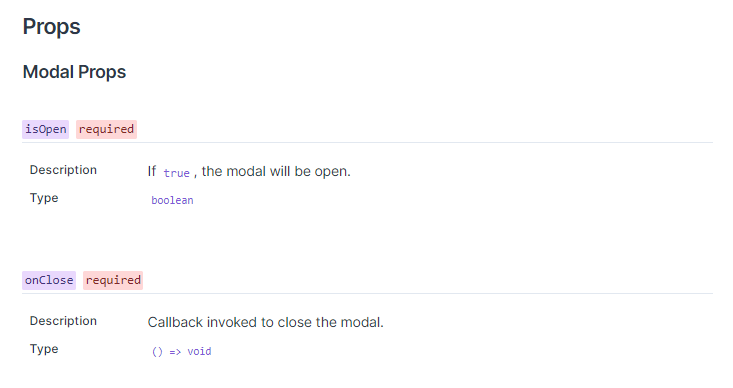
Type Safety
Chakra UI ensures type safety for typescript through interfaces by defining the expected props that can be passed to the components and their types. This is an example of the Modal props
Documentation
Chakra UI provides a comprehensive and extensive documentation to assist users in seamlessly integrating and utilizing Chakra UI within their projects. The documentation is constantly being updated and welcomes contributions from other developers. Explore the Chakra UI documentation here.
Open Source
Chakra UI is an open-source project hosted on GitHub. The repository allows users to view, modify, file issues, create PRs, and contribute to the project. Check out the repository here.
Community Support
Chakra UI is widely used in the React ecosystem and has an active and supportive community. Users can seek help, exchange ideas and collaborate in the discussions forum and community discord platform.
Constant improvements are being made to the Chakra UI library and this can be seen in the founder’s article on ‘The future of Chakra UI’.